If you’ve ever clicked an ad and ended up on a page with one offer, one form and nothing else to click, you’ve been on a landing page. It’s one of the simplest tools in digital marketing, and one of the most underused by small businesses.
So, what is a landing page exactly, how is it different from your homepage, and what makes one actually bring in leads? We’ll cover all of it in plain English, with examples you can copy and a checklist you can use today.
The short version
- A landing page is a standalone page built for one goal, usually a call, a form or a sale.
- It converts better than a homepage because it removes choices and matches what the visitor just clicked.
- The best ones have one offer, one call to action, real proof and fast mobile loading.
- Every paid ad campaign should point to a landing page, not your homepage.
What Is a Landing Page? A Simple Definition
A landing page is a single web page created for one specific marketing goal. Visitors “land” on it after clicking an ad, an email, a social post or a search result, and the page asks them to do one thing: book a call, request a quote, download a guide or buy a product.
That focus is the whole point. Your homepage has to introduce your entire business to everyone. A landing page talks to one type of visitor about one offer, and it removes everything that doesn’t help them say yes.
Technically, any page someone enters your site on is a “landing page” in Google Analytics. But when marketers talk about landing pages, they mean these purpose-built, single-goal pages. That’s the meaning we’ll use here.
Landing Page vs Homepage: What’s the Difference?
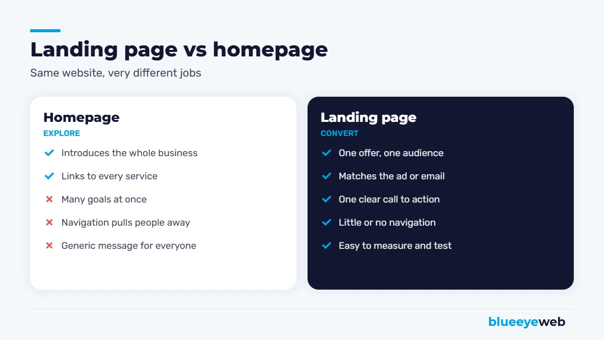
Think of your homepage as the lobby of a building. It has doors to every department, a directory and a receptionist. A landing page is a private meeting room: one conversation, one decision, no distractions.
| Homepage | Landing page | |
|---|---|---|
| Goal | Introduce the business | Get one specific action |
| Audience | Everyone | One segment, one intent |
| Navigation | Full menu | Little or none |
| Calls to action | Many | One (repeated) |
| Traffic source | Mixed | Usually ads, email or a campaign |
| How you measure it | Engagement, clicks | Conversion rate |
| Best for | Brand and discovery | Campaigns and lead generation |
This doesn’t mean your homepage is less important. It means each page should do its own job. When you send paid traffic to a homepage, you’re paying for clicks and then asking visitors to figure out where to go next. Many of them won’t bother.
Why Landing Pages Convert Better
There are three reasons a good landing page outperforms a general page, and none of them are tricks.
1. Fewer choices
Every extra link is a chance for a visitor to wander off. Remove the menu, the blog sidebar and the five competing buttons, and more people take the action you actually want.
2. Message match
If your ad says “Same-day AC repair in Boynton Beach,” the page should say exactly that in the headline. When the page confirms what the visitor clicked, they trust it and keep reading. When it doesn’t, they hit the back button. Google also rewards this: its Quality Score includes a landing page experience rating that looks at how relevant and useful your page is to the ad, and it affects what you pay per click.
3. You can measure and improve it
Because a landing page has one goal, you know exactly whether it works. You can change a headline, a photo or a form and see the difference in leads. Your homepage, with dozens of goals, is much harder to improve with that kind of precision.
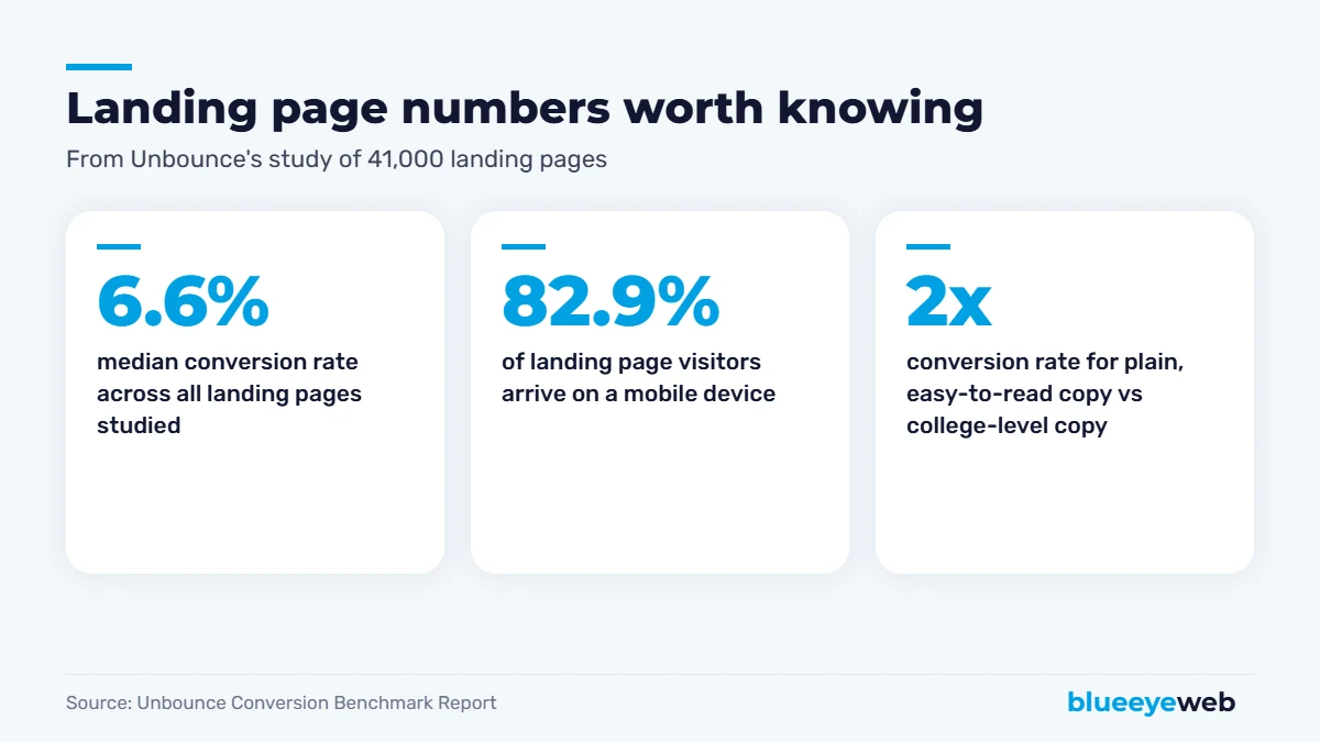
For context, Unbounce’s Conversion Benchmark Report analyzed more than 41,000 landing pages and found a median conversion rate of 6.6%. Two details from the same study matter a lot for small businesses: most visitors arrived on phones, and pages written in simple, easy-to-read language converted at roughly double the rate of pages written at a college reading level. Plain words win.
5 Types of Landing Pages (and When to Use Each)
Lead generation page
The most common type for service businesses. It offers a free quote, consultation, estimate or audit in exchange for contact details. Use it for Google Ads, Facebook ads and local campaigns.
Click-through page
Warms people up before sending them to a checkout or signup. Common in e-commerce and software, where a product needs a bit of explaining before the “buy” step.
Lead magnet page
Offers something useful for free: a checklist, a guide, a price sheet or a tool. It grows your email list so you can follow up later. Our own Free AI Visibility Check page works this way.
Event or booking page
Built around a date: a webinar, an open house, a seasonal promotion or appointment booking. The call to action is “save your spot” or “book now.”
Sales page
A longer page for one product or package, with details, objections answered, testimonials and a buy button. Longer isn’t worse when the decision is bigger. It just has to stay focused.
The Anatomy of a High-Converting Landing Page
Most landing pages that work share the same building blocks. You don’t need fancy design to get them right. You need clarity.
A headline that matches the click
Your headline should repeat the promise from the ad or email in plain words. “Get a free roof inspection in 48 hours” beats “Welcome to ABC Roofing” every time.
A short subheadline that explains the offer
One or two sentences: who it’s for, what they get and why it’s worth it. If a visitor reads only the headline and subheadline, they should understand the deal.
One call to action, repeated
Pick one action and use the same button text throughout the page. “Get my free quote” works better than a vague “Submit.” On mobile, a tap-to-call button at the top is often your best converter.
A form that asks only what you need
Name, phone, email and maybe one qualifying question. Every extra field costs you leads. If you need more details, collect them on the follow-up call.
Proof
Reviews, star ratings, before-and-after photos, client logos, licenses, guarantees and real numbers. Proof answers the question every visitor is silently asking: “Can I trust these people?”
Benefits before features
“Cooler house by tonight” is a benefit. “Licensed HVAC technicians with 15 years of experience” is a feature that supports it. Lead with what the customer gets, then back it up.
Speed
Slow pages kill paid campaigns. In Deloitte’s Milliseconds Make Millions study with Google, a 0.1-second improvement in mobile site speed lifted retail conversions by 8.4%. If your landing page takes five seconds to load, you’re paying for clicks that never see your offer. Check yours with PageSpeed Insights, and if the mobile score is poor, speed optimization is usually the cheapest fix with the biggest return.
The most expensive landing page mistake: sending ad traffic to your homepage. You pay for every click, then make visitors hunt for the next step. A focused landing page often improves results more than any change to the ads themselves.
Landing Page Examples for Small Businesses
Here’s what a good landing page looks like in a few common industries. Use these as starting points, not templates to copy word for word.
Home services (roofing, HVAC, plumbing)
Headline: “Free Roof Inspection in Palm Beach County, Usually Within 48 Hours.” Below it: a tap-to-call button, a three-field form, a row of Google review stars, photos of recent jobs and a short “how it works” section with three steps. That’s it.
Professional services (law, accounting, consulting)
Headline focused on the problem: “Behind on Your Business Taxes? Get a Free 20-Minute Review.” Add credentials, a short bio, two or three client testimonials and a calendar booking widget instead of a long form.
E-commerce
For a promotion, the landing page shows one product or collection, the offer and deadline, key benefits, reviews and an add-to-cart button that’s visible without scrolling. Shipping and returns info goes near the button, because that’s where hesitation happens.
Local clinics and wellness
“New Patient Special: Exam and Cleaning for $99.” Insurance accepted, location map, online booking, real photos of the office and staff. People choosing a provider want to see who they’ll meet.
How to Build a Landing Page That Converts: The Checklist
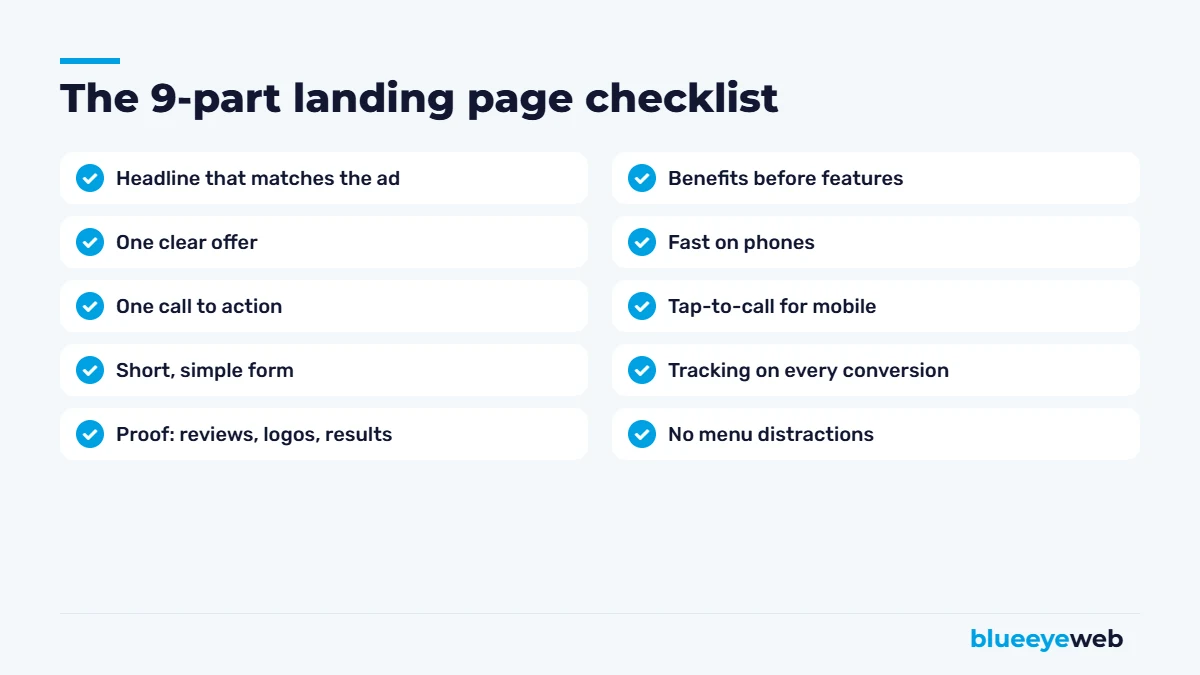
- Define one goal. One offer for one audience. If you have two offers, build two pages.
- Write the headline from the ad. Match the exact promise people clicked on.
- Remove the navigation menu. Keep your logo and phone number, drop everything else.
- Put the call to action above the fold. Visible on a phone without scrolling.
- Add proof near the button. Reviews and guarantees work best right where people decide.
- Keep the form short. Three to four fields is the sweet spot for most service businesses.
- Make it fast. Compress images, skip heavy sliders and test on mobile data.
- Track every conversion. Form submissions and calls should show up in Google Analytics and your ad accounts.
- Follow up fast. A lead that waits a day often goes cold. Tools like AI lead follow-up can reply in seconds, even after hours.
Landing Pages and SEO: Can They Rank on Google?
Yes, but they need to be built differently. Paid landing pages are often short and set to “noindex,” because they exist for ads and sometimes duplicate other pages. That’s fine.
If you want a landing page to rank organically, treat it like a real service page: target a specific keyword, write enough helpful content to answer real questions, add internal links and keep it indexable. Local service pages, like a city-specific page for your main service, are a great example of landing pages that do double duty for ads and SEO. Our local SEO and SEO content writing work often starts exactly there.
Which Tool Should You Use to Build Landing Pages?
If your website runs on WordPress, you can build excellent landing pages with your existing page builder. A blank template, your brand fonts and the checklist above go a long way. Dedicated tools like Unbounce, Leadpages or Instapage make A/B testing easier, but they add a monthly fee and live outside your main site.
For most small businesses, we recommend building landing pages inside your own website. They load fast, use your domain, share your tracking and cost nothing extra each month. Not sure your platform can handle it? Our comparison of WordPress vs Wix vs Squarespace covers what each one does well.
How Much Does a Landing Page Cost?
A DIY page costs your time plus any tool subscription. A professionally designed and written landing page for a small business usually runs from a few hundred dollars for a simple template build to a few thousand for custom design, copywriting, tracking setup and testing. If you’re spending money on ads every month, a page that converts twice as well effectively cuts your cost per lead in half, which is why it’s usually the best money you’ll spend on a campaign.
Want the bigger picture? See how much a website costs in 2026, or compare channels in our guide to Google Ads vs Facebook Ads.
Need a landing page that actually brings in leads?
We design, write and track landing pages for Google Ads, Facebook ads and local campaigns, built fast, mobile-first and on your own domain.
Frequently Asked Questions
A landing page is a single web page built for one goal, like getting a call, a form submission or a sale. Visitors usually arrive from an ad, email or social post, and the page focuses only on that one offer.
A website has many pages and introduces your whole business. A landing page is one focused page, often part of your website, built for a specific campaign, audience and action.
If you run ads or campaigns, yes. Sending paid traffic to a homepage usually wastes clicks because visitors have too many choices. A dedicated landing page matches the ad and makes the next step obvious.
It depends on the industry and offer, but Unbounce found a median of 6.6% across 41,000 landing pages. Lead generation pages for local services often do better because the visitor already has a clear need.
As long as it needs to be to answer the visitor’s questions, and no longer. Simple offers like a free quote can be short. Bigger decisions, like an expensive service, usually need more detail, proof and FAQs.
Usually not. Removing the menu keeps visitors focused on your one call to action. Keep your logo, phone number and essential trust links, and remove the rest.